Why Silver Reads Cooler Than Its Neighbours
Why silver reads cooler than its neighbours: learn to judge its reflective surface and surrounding colours by sight, before deciding what suits a space.
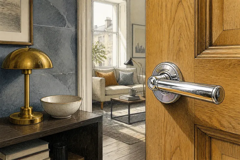
Silver can look icy beside a honey-coloured timber door and almost soft beside a blue-grey stone wall. Why silver reads cooler than its neighbours depends on more than the metal itself: its reflective surface borrows colour from nearby objects, while its bright highlights give the eye a strong cue of chill. A simple visual comparison can separate those effects without buying anything.
Imagine that Mara, an invented and hypothetical reader, is considering a silver-toned handle for a small city flat. She has a photograph of the room, a view of the actual doorway, and a few existing objects nearby: a brass lamp, a dark wooden shelf and a pale ceramic bowl. Her aim is not to choose a finish by reputation. She wants to see what the metal appears to do in this particular company.
Silver’s cool impression begins with reflected light
Unlike a painted surface, a polished metal surface does not simply present one stable colour. It reflects its surroundings, so the visible patch can contain a bright window, a dark coat, a strip of timber or a coloured wall. Even when the material has a recognisably silver appearance, its local colour shifts with the scene it reflects.
That changing image sits alongside silver’s high contrast between bright highlights and darker reflections. The eye often reads sharp, pale glints as cool and crisp. Warm materials such as brass and oak tend to show more golden or brown colour across their surfaces, so the contrast can make silver seem cooler still. This is an impression, not a fixed temperature built into every object.
For Mara, the handle’s shine catches the white of a nearby window. Its brightest stripe looks almost blue against the brass lamp. When she changes her viewpoint, the stripe picks up the lamp’s amber glow, and the same handle appears less cold. The object has not changed; the reflected scene has.
Look at the surface from more than one position before deciding what colour it reads as.
Compare the object with its immediate colour neighbours
A fair comparison needs context. Set the silver object visually beside the colours it will actually share space with, rather than judging it against a blank screen or a distant sample. In Mara’s case, the relevant neighbours are the door timber, the brass lamp, the ceramic bowl and the wall—not a showroom display with unrelated lighting.
She first looks at the handle against the dark shelf. The bright metal appears sharp and cool, in part because the dark background makes its highlights stand out. Against the pale bowl, the contrast softens; the metal looks quieter, although still cooler than the bowl’s creamy surface. Beside the brass lamp, the difference is clearest: one object reflects a silvery white, the other a warm yellow-brown.
These comparisons reveal two distinct influences. The first is colour contrast: nearby warm tones make silver seem cooler by comparison. The second is reflected colour: the metal may actually show some of those warm tones in its image. A polished object can do both at once, which is why a quick glance may give a muddled answer.
To keep the comparison useful, look at the same part of the metal each time. A broad bright area and a dark reflected edge can look like different materials. Compare the highlight with a highlight on another object, then compare the darker area with the surrounding colours.
Change the viewing angle before changing the judgement
Mara checks the handle from the doorway, from the side and from the room’s usual standing position. From directly in front, its face reflects a pale wall and seems nearly neutral. From an angle, it catches the timber door and takes on a faint brown cast. From the room, a window reflection cuts across the surface, restoring the colder, brighter impression.
This is why silver can seem to change character as a person walks past. A curved handle, rounded bowl or metal trim contains reflections from several directions at once. A flat plate tends to show a more legible patch of whatever lies opposite it. Neither form has a single colour that can be judged independently of its surroundings.
For a visual check, move your head rather than the object where possible. Notice whether the surface stays pale, picks up a distinct colour, or alternates between the two. Then ask which view matters most in ordinary use. A handle seen close at the doorway may deserve a different judgement from a fitting glimpsed across the room.
Separate cool colour from brightness and visual sharpness
“Cool” can describe hue, but it can also describe a feeling created by brightness, contrast and clarity. Silver may look cool because it reflects a blue-grey wall; it may also feel cool because a crisp white glint sits beside rounded, matte timber. Those are related impressions, not identical ones.
Mara notices that the handle’s brightest patch looks colder than its quieter edge. She briefly compares it with the pale ceramic bowl. The bowl is lighter overall, yet its creamy colour reads warmer. That comparison helps her avoid treating brightness as the only cause. A light surface can feel warm or cool according to its hue and its company.
She also notices that the dark shelf sharpens the handle’s outline. Against the wall, the outline is less dramatic and the metal seems less severe. The surface has not become warmer, but its contrast has eased. If a silver detail feels too stark, the issue may be its strong edge against a dark background rather than an unwanted blue cast.
Ask two separate questions: does the metal look bluish or silvery-white, and does it look visually sharp? The answers can point to different reasons for the same cool impression.
Why does silver look blue beside brass?
Brass supplies a strong yellow or golden reference, so silver can look bluer by comparison even when it is reflecting neutral light. The contrast is especially noticeable where the two surfaces sit close together. View each material against a less warm background as well, and the difference may seem less pronounced.
Does a matte silver surface look warmer?
A less mirror-like surface usually shows less distinct reflected scenery, so its appearance may feel steadier and less sharply contrasted. That does not automatically make it warm: the surrounding colours and the surface’s own visible tone still matter. Compare it in the same setting rather than assuming that reduced shine changes its hue.
Can a wall colour change the look of silver?
Yes. A silver surface can reflect a nearby wall, and even a diffuse pale colour can shift the impression of its highlights. Stand where the metal is normally seen and compare its appearance against the wall with its appearance against a neutral or differently coloured neighbour.
Which view should matter most in a room?
Give priority to the position from which the object is usually seen and the light it commonly receives. For Mara’s handle, that is the approach into the room, where the window reflection is visible. A second look from nearby still helps explain why its colour changes, but it need not outweigh the everyday view.
Mara’s comparison leads to a clearer decision
After looking from those positions, Mara returns to the doorway and compares the handle with the brass lamp, timber and bowl in turn. She finds that the strong blue-white flash appears mainly when the window sits in its reflection. Beside the bowl, the surface looks calmer; beside the brass, it remains distinctly cooler. She decides that the contrast suits the room’s existing mix rather than clashing with it.
That is the useful result of her invented exercise: not a universal verdict on silver, but a reasoned description of how this object behaves here. She can say that the handle looks sharp from the entrance, warmer at an angle and cooler beside the brass. Those observations are more useful than calling it simply “cold” or “neutral”.
For your own comparison, keep the process small and concrete:
- Choose the actual silver object or a visible silver-toned detail, not an imagined finish.
- Identify its nearest warm and cool neighbours, such as timber, brass, stone, paint or ceramic.
- Look at the same patch of metal beside each colour.
- Change your viewing angle and note which surroundings appear in the reflection.
- Compare a bright highlight separately from a darker reflected area.
- Judge the view that matters in ordinary use, then record what caused any change in impression.
In Mara’s case, the final choice rests on the metal’s relationship with its neighbours, not on a claim that silver is inherently chilly. That distinction helps explain why silver reads cooler in one arrangement and quieter in another. Before deciding that silver is wrong for a space, look at what its surface is reflecting—and at the colour beside which your eye is making the comparison.